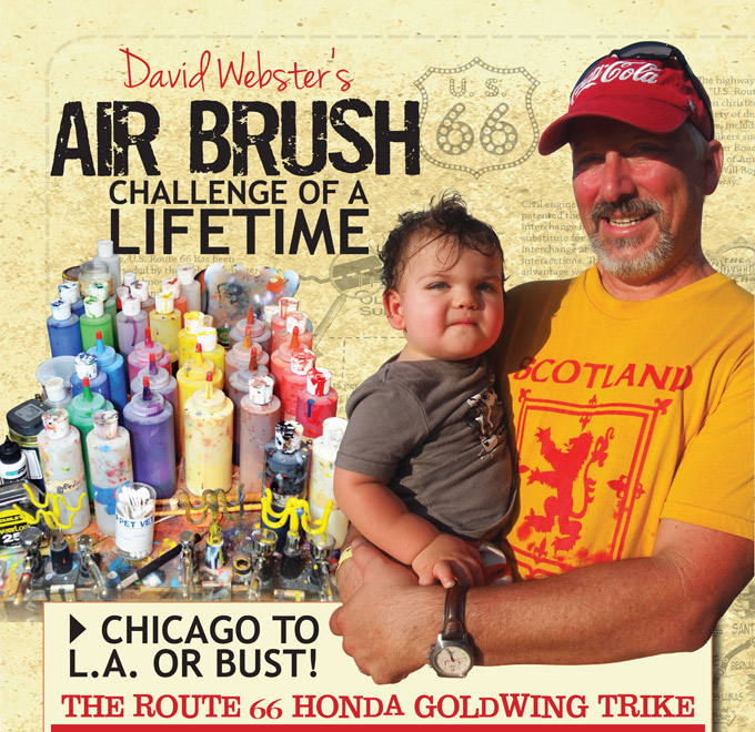
Chicago to LA or Bust … The airbrush challenge of a lifetime
THE INTRODUCTION TO THE PROJECT
It was Christmas dinner at my brother’s house in Daytona Beach when he told me about a client named Fred, who was interested finding someone to airbrush a trike he was planning to build. Fred was one of my brother’s bigger legal clients and it was a real honor to have him personally recommend me. If that didn’t put a little pressure on me, I found out that Fred had been having trikes created for years by one of the most talented airbrush shops in the Daytona area. When Fred sent me images of his previous trikes the stakes for this project were raised about as high as they can get. I had seen the Margaritaville trike displayed at a Rats Hole bike show a few years earlier. The work was really amazing, and I was going to have my work cut out for me to raise that bar and impress this customer. The most daunting element of this job was the concept, “Route 66.” Fred wanted to capture the feel of a Route 66 travel brochure from the time of its heyday back in the ’50s.
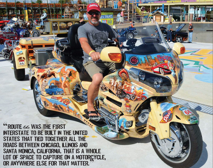
Route 66 was the first interstate to be built in the United States that tied together all the roads between Chicago, Illinois and Santa Monica, California. That is a whole lot of space to capture on a motorcycle, or anywhere else for that matter. It took a month to research Route 66 with books, films, and Google. One of the most telling films I saw was actually a modern animated movie called Cars. It was about a small town called Radiator Springs that embodied all the misplaced small towns that used to line Route 66 in its heyday. When a new super expressway went in so people could get across country faster towns like that became ghost towns. The movie helped me to remember what it was like as a kid riding across the Mid West with my parents on vacations. My dad just liked to get in the car and drive, and I remember trips that probably were on Route 66. He just enjoyed getting out and seeing things and being behind the wheel. This lifestyle was slower and more appreciative of the small town way of life. The roads actually moved around the landscape and you could see so much more of what the areas had to offer. I remember riding through the mountain paths and thinking that’s a heck of a drop over the side and wishing maybe the road could be a little wider! The best part of those trips for me and my brothers was seeing the Holiday Inn sign at the end of the day. We knew they would have a swimming pool and that was all we needed to be happy. I found through our conversations that Fred was a person who enjoyed getting on the open road and experiencing life in the way the people did on Route 66. I really wanted to capture the feel of that for him with this project.
BUILDING THE CONCEPT OF ROUTE 66
I wanted to make sure everything about the job would cause anyone who viewed the bike to feel like they were looking at something that reflected the era of the ’50s. In order to set the tone for the bike I had to come up with a base color that felt like it was from that era. Fred had expressed some interest in the woodies of that time period and he wanted to see some on the trike somewhere. I found this convertible Town and Country that seemed to have a color that would be a great ground for all the diverse colors that were going to be brought together on it. I like the wood grain as well and it would become a key element in the trailer that was going to accompany the trike.
This project started out in Photoshop and it allowed me to pull together the immense amount of information that was going to have to come together in order to fully capture what Fred imagined for this job. At first I photographed one of his older trikes so I could get a sense of space that the images would have to be place in. I wiped out the images that were originally on it and used Photoshop to superimpose the images on it as I intended to paint them. Without this technology I would have had an impossible task of planning the placement and size for the hundreds of images that had to come together and feel like they moved logically across the trike. The first area I worked on was the front faring and fender because I felt like it would be a key area on the trike. I wanted to solidify the direction I would take with the images and how they were going to be brought together.
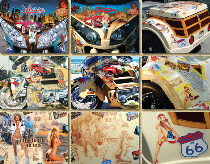
It is absolutely critical to get inside the customers head as early on in the design process and find out what their vision is. Photoshop is a great tool for getting an almost realistic impression of what the trike might look like before any painting is begun. It allows me to quickly place images into the space and get feedback from the customer before too much time is committed. The funniest thing about the first image on the left was that I sent Fred two compositions to get a feel for what he wanted to see. The first one is pictured above with the Playboy Bunny front and center. The second one didn’t have the Bunny and that was the one my wife liked the most. He picked the one with the Playboy Bunny and that helped me to understand what he would like to see on the rest of the trike. The Playboy Club was a big part of the culture in Chicago in the early fifties, so it served a historical purpose as well as adding something visually interesting for Fred to look at. He wanted the project to be true to the concept, but he enjoyed throwing a pinup into the lineup whenever possible for points of visual interest. I tried to make sure that I found interesting classic images from Route 66 and also great images that felt like they should have come from that era.
Once I had Fred’s approval on the first panel it solidified the project direction, and I moved forward with planning all the panels. It was on the left side of the front faring that I came up with the plan to add a graphic element to further tie all the panels together. I decided to render the road atlas in the background of all the panels and show the maps from Illinois to Santa Monica Pier. This was going to be the element that truly set this job apart from anything anyone had ever done like this. I think that is partly because it was such a pain in the ass to do no one else would want to do it. I nearly doubled the amount of time it took to do each panel. I trudged through it because it added a feel that couldn’t have been accomplished any other way. The down side to this job was there was absolutely no easy way to do any of it. It was by far the most difficult, time consuming, problematic, and quite often tedious project I have ever taken on. I teach art at the Art Institute of Jacksonville, and I constantly tell my students that the work isn’t always easy or fun when you are producing something of great quality.
Once the plan was about 75 percent complete I was delivered the first part to be painted and that turned out be the trailer. Of course that was the one thing I hadn’t worked on a plan for yet. As Fred was dropping it off I got an idea to do postcards, a fake woody siding, and to put two pinups on the top. One of them would be from Chicago and the other would be from Santa Monica. I googled, “girl in a bikini with a parka” and it immediately pulled up the current Sports Illustrated cover with Kate Upton topless in a Polar Bear white parka. All I had to do was to add her legs from another photo shoot and the boots from another. I found another cover photo of her on the beach in California. With that one the transformation was much simpler. She had a painted on bikini bottom that wasn’t doing her justice so I painted it off. That whole concept came together in a matter of days. I sent the images to Fred for his approval and now it was time to get-r-done!
ROUTE 66 COMPLETED
1. I try to find ways of helping the viewer to slow down as they travel across my illustration of Route 66. No matter where you are in the design I made a point of identifying it in one way or another as Route 66. The very first image that I bring you to on the trike is the road itself with old gas station logos and the illuminated Holiday Inn sign in the distance. I wanted it to visually move you into the direction of the Chicago panel above it. From there the idea was to start at the front faring in Chicago and then begin to travel visually down the route seeing icons and landscape vignettes that would appear along the way. Chicago is famous for its pizza, the Chicago Cubs, The Theater, trolley cars, and of course the Play Boy Club.
2. From the front of the bike the path travels down the left side of the trike through Illinois with a few of the iconic images that have been made famous by the highway.
3. In Springfield there is the Lincoln Memorial and the Cozy Dog Drive In, the Gemini Giant in Wilmington, and Our Lady of the Highway in Montgomery. The image travels down to the footplate where it crosses a bridge into Missouri.
4. In Missouri, Fred had made a point of wanting to focus on the Budweiser Brewery and that was located in one of the more notable cities St. Louis, with the Arch signifying the entrance way to the West. I used the cityscape with the arch to create a dramatic entrance for the Budweiser Clydesdales.
5. That leads your eye to the Brewery itself, featuring the Bud girl and the Anheuser logo. Just above that is one of the tourist attractions I remember visiting as a child, the Meramec Caverns in Stanton, Missouri. On the way out of Missouri I felt it wouldn’t be complete without a river boat and an image of the man who wrote so many stories centered on the Missouri River, Mark Twain. From there it’s on to Kansas where Route 66 spent very little time in.
6. The Big Boy sign was a familiar sight back then and was one of my favorite restaurants as a child. Their Big Boy Double Burger was ripped off by McDonald’s Big Mac. It was exactly the same only slightly bigger, at least in my memory. I had to feature a pinup in the center of the tank so there would be something to look at from the driver’s seat.
7. From there I bring you to the right side of the bike and the state of Oklahoma. There was a lot of interesting imagery and history to work with in this state. One of the most notable characters was Will Rogers, who was a very famous rodeo cowboy and entertainer. Just as notable were the Indians such as Princess Pale Moon of the Oklahoma Choctaws. Of course a girl fixing the flat tire of her pretty red corvette might get your attention as well. One of the things I felt had to be there was leading you off into Texas– the unusual Blue Whale from Catoosa that is a feature of a roadside swimming park.
8. Entering Texas, I bring you first to the Cadillac Ranch, which is a series of Caddy’s set upright in the desert and painted by tourist as a sort of interactive attraction. Of course it wouldn’t be Texas if there weren’t cattle, the Big Texan steak Ranch, an old truck, and a hot cowgirl.
9. The Upper trunk was a very complex section and featured two different states. On the side of the upper trunk was one of the highlights of the trike. On the New Mexico side, I featured the sign from a very famous hotel called the Blue Swallow. In front of it was a roadside totem from Gallup, New Mexico.
10. Below that features more of New Mexico, where there were a lot of local icons to have fun with. Fred had mentioned he wanted Area 51 featured somehow, so I threw in the Area 51 logo from a ’50s movie and put alien heads on the Easy Riders.
11. Moving on to Arizona where there was some of the more dramatic landscape imagery to work with. I put together about 14 different images to make this scene of the rafters coming through the Grand Canyon. The American Indian, the bald eagle, and the clear blue skies are also symbolic of the area’s past and present—helping to convey what a driver might experience on this part of the trip.
12. On the left side of the Trunk I brought out some more of the funny characters as well as the ghostly image of one of the area’s most famous heroes, Geronimo.
13. As I move the viewer back down to the back fender you travel through the desert and encounter an old roadside store whose disrepair only adds to its character. From here the image moves back, and you begin to encounter images that embody some of the qualities that draw people to California. The creativity is hinted at with the Big Daddy Rat Fink riding a wave, the classic woody overlooking and a breathtaking image of the Big Sir.
14. In a close up you can see some of the details of the Big Sir landscape, the palm trees turned out awesome and of course the hot girl in a bikini. That never gets old!
15. On the reverse side of the back you get another hot girl with a woody to balance the pair on the left, as well as another matching awesome palm tree. The bottoms of each fender had matching surfer sunrises to capture the Endless Summer theme that brought California and surfing to the forefront of the minds of Americans.
16. The final image captures the view of the back of the bike as you might encounter driving up from behind. You find the Beach Boys on the beach in front of the Santa Monica Pier that is the official end of Route 66. On the opposite side is the Hollywood sign and one of the most recognizable icons of the silver screen Marylyn Monroe. Last but not least is the Pacific Ocean with its shores echoing the shores of Lake Michigan where the trip began.
17. This was probably the most wonderful image of all and it is of Fred and his friends getting ready to take their trip down Route 66. Fred is on the far left with a cream colored t-shirt. They started at the opposite end of the trail and headed back to Chicago. It took so long to get this project completed that they nearly had to cancel the trip. I got the final parts to him 10 days before the trip was to begin and the trike was put together two days before departure time. In the end, I have never had a customer more excited about a project or more gracious. Fred was never negative in any way and gave me free range with the project for all the artistic decisions. He was so excited about the art that he sent photos from his phone every time he came across one of the images on the trike!
THE PROCESS OF BRINGING ROUTE 66 TO LIFE
The first part of the trailer to be painted was going to be the top and it was one of the most interesting panels on the project. It was going to establish the tone and expectations for everything else to come. I scaled the Photoshop image to the size of the lid and printed it out on a tabloid size printer (11×17”). The panels were taped together with scotch tape to create a full size pattern to transfer to the panel. The image was traced onto the panel by applying an oil based pastel to the back and then tracing over the image. The image comes through faintly but just enough to allow me to have an idea of where the forms are going to be and sets the basic shapes. I used a neutral brown so it would fade into the undertone as it was painted on to establish the forms more clearly before adding more colors and values.
With all the images on the trike, I first laid down a light brown that had been desaturated with some of the trikes base cream color. This created a unifying undertone to bridge the rest of the colors across the trike. With a bridge color I create a neutral from the three primary colors of blue, red, and yellow that has a slight lean towards red. With this color it can be introduced into any other color to desaturate them and make them feel like a part of the color family in the project. The neutral color also became the color of all the base road lines for the atlas maps and this tourist map that was set into the background of the top of the trailer. Once I laid down the neutral brown and then the accents on the maps of red, white, and blue I then misted over the base coat color to face the map back into the ground color of the bike. That way the detail didn’t distract from the images in the foreground and it became more like an under skin to the design.
The next color I added to the image was on the postcards that are bordering the top. I did this next because they had to be done separately from the rest of the top because they have such sharply defined edges. I reverse masked them with a clear vinyl application tape called TransferRite. Its really amazingly easy to apply, cut, and remove. The great thing about this stuff is it allows me to mask off areas as I’m working and work up the foreground and then jump into the background. It keeps hard edges from getting to hard and for the whole process to stay fluid. The other bonus is it is cheaper than frisket and doesn’t leave behind a glue residue.
The next element that I had to do was the woody effect on the sides of the trailer. It took a little bit of pre planning and a lot of taping and back taping to make this area come together. I created vinyl stencils that were perfectly shaped to conform to the trailer by first wrapping the trailer sides with paper and drawing out the shapes the way I wanted them. Then I scanned the tracing so that I could create perfectly sized stencils. This was fairly time consuming to make the stencils, but it allowed me to establish the shapes perfectly. Once the stencils were on I used a really simple process of wood graining. First the lighter color of a two color process was laid down with a Sata Mini Jet spray gun. I then brushed on the second darker color to create the wood grain effect. I used a cheap throw away brush from Lowes that had course hairs in order to create a nice wood grain. The paint for the darker colored actual grain was Wicked Automotive acrylics. The acrylics allowed the pigment to stay wet long enough to be brushed on and manipulated slightly when needed. It literally only took minutes to create an absolutely amazing looking wood grain effect. I did the center panels first and then back taped those panels and painted the outer panels. Once the wood grain was on, I went in and put in the shadows to give it a three dimensional look. The prep work was most of the time on this part of the project.
In the next image you can see where I completed the text and the Route 66 sign by using a two-stage stencil created with a vinyl cutter. This allowed there to be some forms that appear flawless and others that take on a softer feel. In the second photo you can see the clear vinyl being used to work on every other post card. The vinyl can only go so far on rounded surfaces without crimping, so I had to work in small sections. That is the one drawback of working on rounded canvases.
Every area of the trike had to be laid out first and then I had to figure out how to chop them up so they could wrap around the rounded surfaces. The large back area that went over the tires was the most challenging area of the trike and that is saying something. It took over 300 hours for this one piece. It was like wrapping a huge globe with images that had to flow together perfectly in the end. There was so much going on back there that without days of planning all that imagery could have come out looking like a total cluster. This was the final Photoshop plan for the very back area of that space. It took 12 different photos just to create the part of the scene around the license plate and that doesn’t include the map.
You can see all the splices that had to be made in order to make this image lay out on the trunk and fenders. Every area of the trike presented similar tactical problems.
This area of the trike is one of my favorites because of the Big Sur image on the top. This area like so many on this trike had me stressed out completely before I started laying down the forms. The trickiest area was the foreground with the flowers because there was not really anything definite to render. In order to resolve that issue I decided to treat it like an abstract space where I just created some basic ground shapes without trying to define them with too much detail. Then I went in and suggested some flower and weed shapes on top to create focal points. The result was simple and allowed the other elements like the water and the woodies to become the main points of interest.
The last thing I wanted to show was a close up of what the map work looked like. It sort of sums up the level of detail that was needed to pull this whole job off. I had to purchase two new high end guns just to be able to speed up the painting process with this project. I normally would use a Satagraph 300 for all of the up close detail work and have two Iwata HP-C plus guns for the simpler shapes and fill colors. I needed to be working with five colors at the same time for most of these panels, so I was going to add two new Satagraphs to the line up. Unfortunately, I found out the guns are no longer going to be in production. I bought the last one that Coast Airbrush had and then they recommended a Harder and Steenbeck Infinity brush. Apparently they built the Satagraph guns and this was their product made with the same trigger mechanism that makes the Satagraph … so amazing to work with. The funny thing was when the gun came in the mail I hooked it right up and started to try and work with it. It didn’t look like the front nozzle cap would come off, so I thought what a screwed up way to make an airbrush! I cleaned it out and set it back in the box to send it back. Then I had a flash of genius. Maybe I should look in the manual and see if it has any instruction on how to take it off. Sure enough there it was in a photo on the first page. Some times it pays to read those things even if it hurts to do it. The Infinity turned out to be heads and tails better than the Iwata HP-C and only slightly less capable of the refined detail that the Satagraph was able to produce. The end result was I was now able to work at a much faster pace.
When all was said and done the trike turned out better than I had imagined it could have. It was a challenging project that went on and on like the road itself. I feel like I understand why there is a draw to highway still today even though most of it has been transformed or grassed over. It represents slowing down and appreciating the world that is out there. This job stressed me to the point of wanting to walk away more than a few times and pushed my skill levels to a new level. In the end I feel like it was all worth it because the result is truly as breathtaking as the concept I was trying to communicate. With the completion of this project, I moved on to an even larger one that will be digitized and warped on a ‘38 Sport Fishing boat called Bloodsport. Check out the mind blowing way that project turned out at www.davidwebserart.com or Facebook page airbrush jax. There is no job too big or unusual so bring on the next one with your idea for my next work of mobile art.